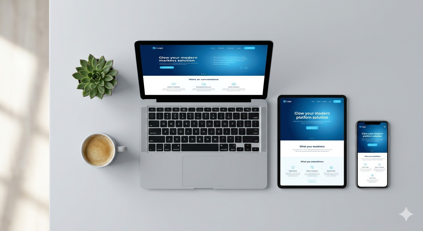
Responsive Website Design | Mobile-Friendly & Modern Sites
In today’s digital world, people browse the internet on phones, tablets, laptops, and desktop computers. Therefore, your website must look great and work perfectly on every screen size. This is exactly where responsive website design becomes essential for every business.
Responsive website design is a development approach that automatically adjusts a website’s layout based on the user’s screen size. In other words, your site looks clean and professional whether someone views it on a small smartphone or a large monitor. Moreover, it removes the need to build separate websites for mobile and desktop users.
Today, more than 60% of global internet traffic comes from mobile devices. Therefore, if your website does not adapt to smaller screens, you are already losing a large portion of your potential customers. People leave slow, broken, or hard-to-read websites within seconds.
Furthermore, search engines like Google now use mobile-first indexing. This means Google primarily checks the mobile version of your website to determine your search ranking. So, a website that is not mobile-friendly will rank lower in search results, which directly hurts your online visibility and traffic.
At UDM , we understand that a modern, responsive website is not just a design trend. It is a business necessity. In addition, it shapes how your audience perceives your brand from the very first click. Let us explore why responsive website design matters, how it works, and what it can do for your business.
Why Responsive Website Design Is No Longer Optional
A few years ago, businesses could get away with a desktop-only website. However, those days are completely gone. Mobile usage has exploded, and user expectations have changed dramatically.
Today, visitors expect a smooth experience no matter what device they use. Therefore, if your website looks broken or difficult to navigate on a phone, users will simply leave and visit your competitor. Moreover, that lost visitor may never come back.
Furthermore, Google officially moved to mobile-first indexing in 2019. This means your mobile site performance directly impacts your Google ranking. So, a non-responsive site is not just a design problem. It is an SEO problem as well.
In addition, mobile-friendly websites tend to have lower bounce rates and higher engagement. When users can easily read your content and click your buttons, they stay longer and take action.
How Responsive Website Design Actually Works
Responsive design works through a combination of flexible layouts, fluid images, and CSS media queries. These three elements work together to create a seamless experience across all devices.
Fluid grids use percentage-based widths instead of fixed pixel sizes. Therefore, elements on the page resize proportionally based on the screen. Moreover, this prevents content from overflowing or breaking on smaller screens.
Flexible images automatically scale within their containers. In other words, an image that looks large on a desktop will shrink cleanly on a mobile screen without losing quality or getting cut off.
CSS media queries are rules that tell the browser how to display content at different screen widths. Therefore, a developer can define specific layouts for phones, tablets, and desktops using the same codebase. This approach is far more efficient than building multiple versions of the same site.
The Business Benefits of a Mobile-Friendly Website
Investing in a mobile-friendly, modern website delivers real, measurable results for your business. Therefore, it is not just about looking good. It is about converting visitors into customers.
Better User Experience
When your website works well on every device, visitors enjoy using it. Moreover, a positive experience builds trust and encourages people to explore more pages. Users who feel comfortable on your site are far more likely to reach out, make a purchase, or book a service.
Higher Search Engine Rankings
Since Google uses mobile-first indexing, a responsive website gives you a clear SEO advantage. In addition, page speed, which is closely tied to responsive design, is also a ranking factor. Therefore, a well-built responsive site helps you rank higher and attract more organic traffic.
Lower Maintenance Costs
Managing one responsive website is much easier and more cost-effective than maintaining separate desktop and mobile versions. Furthermore, any updates you make apply across all devices instantly. This saves your team time and reduces long-term development costs significantly.
Increased Conversion Rates
A clean, easy-to-navigate website on mobile leads to more form submissions, calls, and purchases. Therefore, responsive design directly supports your sales goals. Moreover, users are far more likely to trust a business with a professional, modern online presence.
Key Features of a Modern Responsive Website
Not all responsive websites are created equal. Therefore, it is important to understand what separates a high-quality responsive site from a basic one.
Fast Loading Speed
Speed matters more than most people realize. In fact, research shows that a one-second delay in page load time can reduce conversions by up to 7%. Therefore, modern responsive websites are built with optimized code, compressed images, and efficient hosting.
Moreover, Google’s Core Web Vitals now measure page speed, visual stability, and interactivity as ranking signals. In addition, these metrics directly affect how Google scores your site in search results.
Touch-Friendly Navigation
Mobile users tap and swipe instead of using a mouse. Therefore, a modern responsive site uses large buttons, easy menus, and touch-friendly elements that work smoothly on touchscreens. Moreover, dropdown menus are replaced with mobile-friendly alternatives like hamburger menus.
Readable Typography
Text that looks perfect on a desktop can become tiny and unreadable on a phone. Therefore, responsive websites use scalable font sizes and proper line spacing to maintain readability on every screen. Furthermore, headings and body text adjust automatically for maximum clarity.
Clean and Minimal Design
Modern websites embrace clean layouts with plenty of white space. Therefore, visitors can focus on what matters most — your message, your services, and your call to action. Moreover, a clutter-free design loads faster and feels more professional to the user.
Responsive Website Design and SEO: A Powerful Combination
Responsive website design and SEO work hand in hand. Therefore, getting one right makes the other stronger. A well-designed responsive site gives Google everything it needs to index and rank your content effectively.
First, a single URL for both mobile and desktop versions eliminates duplicate content issues. In other words, you do not split your SEO authority between two separate URLs. Therefore, all your backlinks and traffic point to one strong source.
Furthermore, a responsive site reduces your bounce rate. When visitors have a good experience and stay on your site longer, Google interprets this as a positive signal. Moreover, this can lead to better rankings over time.
In addition, responsive design supports local SEO efforts. Many local searches happen on mobile devices. Therefore, if your site is mobile-friendly, you are better positioned to capture local customers who are searching for your services nearby.
Common Mistakes Businesses Make With Website Design
Even well-intentioned businesses make design mistakes that hurt their performance. However, knowing these pitfalls helps you avoid them when building or updating your website.
Ignoring Mobile Users
Many businesses still design websites with desktop users in mind first. However, this approach is backward in the current digital landscape. Therefore, always prioritize the mobile experience during the design phase, then scale up for larger screens.
Using Too Many Pop-Ups
Pop-ups that cover the entire screen on mobile are a major user experience problem. Moreover, Google has actually started penalizing websites that use intrusive interstitials on mobile. Therefore, keep pop-ups minimal and easy to dismiss.
Slow Image Loading
Large, uncompressed images are one of the most common reasons websites load slowly. Therefore, always compress and optimize images before uploading them. Furthermore, use modern formats like Web to reduce file sizes without sacrificing visual quality.
Poor Call-to-Action Placement
On mobile, buttons and calls to action must be easy to find and tap. However, many sites bury their CTAs at the bottom of long pages or make buttons too small to click accurately. Therefore, place clear, prominent CTAs where users can see them without scrolling excessively.
What to Look for When Choosing a Web Design Partner
Selecting the right web design agency is one of the most important decisions you will make for your online presence. Therefore, it pays to know exactly what to look for before you commit.
A Portfolio of Responsive Designs
Always review a web designer’s past work. Moreover, test their previous sites on your own mobile device to see how well they perform. A strong portfolio of mobile-friendly, modern sites is a reliable indicator of quality.
Understanding of SEO Best Practices
Design and SEO must go together from day one. Therefore, choose a partner who builds websites with proper heading structures, fast load times, clean code, and mobile optimization baked in. Furthermore, a good agency will also advise you on content strategy and on-page SEO basics.
Clear Communication and Process
A reliable web design partner communicates clearly, meets deadlines, and keeps you informed throughout the project. Moreover, they should explain their process in plain language, not confusing technical jargon. Therefore, you always know exactly what is happening with your project.
Ongoing Support After Launch
A website is never truly finished. Therefore, you need a partner who offers ongoing maintenance, security updates, and performance monitoring after your site goes live. Moreover, regular updates keep your site fast, secure, and relevant over time.
How UDM Approaches Responsive Website Design
At we build websites with a mobile-first mindset. Therefore, every project we take on starts with the mobile experience and scales up beautifully to larger screens. Moreover, we combine clean design with solid technical foundations to deliver sites that perform well in both search engines and in real user interactions.
We focus on speed, clarity, and conversion. Furthermore, we work closely with each client to understand their goals, their audience, and their industry. This allows us to create a website that is not just visually impressive but also strategically effective.
In addition, we stay current with Google’s latest algorithm updates and design best practices. Therefore, our clients benefit from websites that are built for long-term success, not just short-term aesthetics.
Moreover, we believe that great design should be accessible to businesses of all sizes. Therefore, we offer flexible packages that deliver professional results without unnecessary complexity or inflated costs.
The Role of Modern Design Trends in Responsive Websites
Design trends evolve constantly. However, some elements have proven their value and continue to define what a modern, responsive website looks like in 2024 and beyond.
Minimalist Layouts
Less is more in modern web design. Therefore, minimalist layouts remove distractions and guide users naturally toward your key messages and calls to action. Moreover, they load faster and feel more trustworthy to visitors.
Bold Typography
Large, expressive fonts help websites communicate personality and professionalism instantly. Furthermore, bold headlines create a strong visual hierarchy that makes content easy to scan on any device.
Micro-Animations
Subtle animations, like buttons that change color on hover or images that fade in as you scroll, improve user engagement. Moreover, they make a website feel polished and alive without slowing it down. Therefore, they are a smart addition to any modern responsive design.
Dark Mode Compatibility
More users now prefer dark mode on their devices. Therefore, forward-thinking websites are designed to support both light and dark display preferences. Moreover, this shows attention to detail and respect for the user’s personal preferences.
Conclusion: Your Website Is Your First Impression — Make It Count
Responsive website design is one of the smartest investments any business can make in today’s mobile-driven world. Therefore, having a website that looks great and performs flawlessly on every device is no longer a luxury. It is a baseline requirement for staying competitive online.
Throughout this article, we have explored how responsive design works, why it matters for SEO, and what key features define a truly modern website. Moreover, we have looked at the common mistakes businesses make and what to look for in a quality web design partner.
The bottom line is simple. Your website is often the very first interaction a potential customer has with your brand. Therefore, it must make a strong, positive impression instantly. A slow, outdated, or mobile-unfriendly site pushes people away. However, a clean, fast, and responsive website builds trust and encourages action.
Furthermore, the connection between responsive website design and business growth is direct and proven. Better user experience leads to longer visits. Longer visits lead to more conversions. More conversions lead to more revenue.
At UDM , we are passionate about building websites that do exactly that. In addition, we bring together strong design, clean code, and smart SEO to deliver results that matter. Therefore, if you are ready to take your online presence to the next level, now is the perfect time to start. Contact UDM today and let us build something remarkable together.
Frequently Asked Questions
1. What is responsive website design and why does my business need it?
Responsive website design is a development approach that allows a website to automatically adjust its layout and content based on the screen size of the device being used. Therefore, your site looks and works perfectly on phones, tablets, and desktops without needing separate versions. Your business needs it because most internet users now browse on mobile devices, and Google rewards mobile-friendly sites with higher search rankings. Moreover, a responsive site improves user experience, reduces bounce rates, and directly supports your conversion goals.
2. How does responsive website design impact SEO and Google rankings?
Responsive website design has a significant and direct impact on SEO. Google uses mobile-first indexing, which means it primarily evaluates the mobile version of your website when determining your search ranking. Therefore, a site that is not responsive will rank lower than competitors who have invested in mobile-friendly design. In addition, responsive sites load faster, have lower bounce rates, and provide a better overall user experience — all of which are positive ranking signals for Google. Furthermore, a single responsive URL consolidates your SEO authority instead of splitting it across multiple site versions.
3. How long does it take to build a responsive website, and what factors affect the timeline?
The timeline for building a responsive website depends on several factors, including the size and complexity of the site, the number of pages, custom features required, and how quickly content and feedback are provided. Therefore, a simple business website may take two to four weeks, while a more complex site with custom functionality can take six to twelve weeks or more. Moreover, working with an experienced agency like UDM helps streamline the process because they follow a clear, structured workflow from strategy and design through to development and launch. In addition, having your content, branding, and goals defined clearly before the project starts always speeds up delivery.
If you want to make your ERP system you can contact us or directly call us our details are as follows:
Contact us via contact page :- https://udmcreative.com/contact/
Direct call us :- 03475159209
Location :- Sector C2 Haris Plaza Mirpur Azad Kashmir


