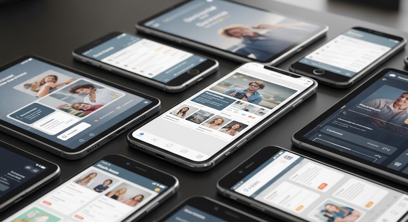
Mobile-First Design Principles: The Ultimate Guide
In today’s digital landscape, a website’s success hinges significantly on its accessibility and performance across various devices. Therefore, understanding and implementing Mobile-First Design Principles has become paramount for web developers and designers alike. This approach prioritizes the mobile user experience, ensuring that core content and functionality are delivered efficiently to smaller screens before progressively enhancing for larger displays.
Traditionally, websites were designed for desktop computers first, then adapted for mobile. However, with the explosion of smartphone and tablet usage, this ‘desktop-first’ method often resulted in clunky, slow, or poorly optimized mobile experiences. Consequently, the mobile-first strategy emerged as a superior alternative, advocating for a design process that begins with the most constrained environment – the mobile screen.
What Are Mobile-First Design Principles?
Mobile-first design is more than just making a website responsive; it’s a fundamental shift in mindset. It involves designing for the smallest screen first, focusing on essential content and functionality, and then scaling up for larger screens. This method ensures a lean, efficient, and user-centered experience from the outset. Ultimately, it forces designers to make critical decisions about what truly matters to the user.
The Philosophy Behind It
The core philosophy of mobile-first design revolves around progressive enhancement. Initially, you build the foundational experience for mobile devices, which often means prioritizing speed, readability, and immediate utility. Subsequently, as screen real estate increases, you add more complex features, richer media, and enhanced layouts. This approach inherently creates a more robust and performant website for all users.
Shifting from Desktop-First
Moving away from desktop-first thinking requires a conscious effort. Historically, designers would cram as much information as possible onto a desktop layout, then struggle to remove or hide elements for mobile. Conversely, with mobile-first, you start with minimalism. This ensures that only the most crucial elements are present, preventing information overload and improving user focus on smaller screens. Hence, the user journey becomes smoother.
Key Benefits of Adopting Mobile-First Design
The advantages of embracing Mobile-First Design Principles are numerous, impacting everything from user satisfaction to search engine rankings. Importantly, these benefits contribute to a more sustainable and future-proof digital presence.
Improved User Experience (UX)
By prioritizing mobile, you inherently focus on speed, simplicity, and ease of use. This leads to a superior user experience, as navigation is streamlined, content is legible, and interactions are intuitive. Users are less likely to abandon a site that performs well on their mobile device, thereby increasing engagement and conversions. Furthermore, a good mobile UX builds trust.
Enhanced SEO Performance
Google officially adopted mobile-first indexing in 2018, meaning it primarily uses the mobile version of your content for indexing and ranking. Therefore, a well-optimized mobile-first site is crucial for SEO. Faster loading times, a responsive layout, and a positive user experience are all factors that search engines favor, leading to higher rankings and increased organic traffic. Clearly, SEO is a major driver.
Faster Loading Times
Designing for mobile first encourages a lean approach to development. This often means optimizing images, minimizing code, and prioritizing essential assets. As a result, websites built with mobile-first principles tend to load faster on all devices. Faster load times reduce bounce rates and improve overall user satisfaction, which is a critical performance metric. Indeed, speed is a feature.
Future-Proofing Your Website
The digital landscape is constantly evolving, with new devices and screen sizes emerging regularly. By starting with the most constrained environment, you create a flexible foundation that can easily adapt to future technologies. This proactive approach ensures your website remains relevant and accessible, regardless of how users choose to interact with it. Consequently, you save time and resources in the long run.
Core Mobile-First Design Principles in Practice
Implementing Mobile-First Design Principles involves a set of practical considerations that guide the design and development process. These principles ensure that the final product is both functional and aesthetically pleasing across all devices.
Prioritize Content and Functionality
Begin by identifying the absolute core content and functionality your users need on a mobile device. What is their primary goal when visiting your site? Strip away anything non-essential. This ‘content-first’ approach ensures that the most valuable information is always accessible, regardless of screen size. Moreover, it prevents clutter and improves focus.
Embrace Progressive Enhancement
Start with a solid, accessible base for mobile, using standard HTML and CSS. Then, progressively add more advanced features and styling for larger screens and more capable browsers. This ensures that even users with older devices or slower connections still get a functional experience. Ultimately, everyone benefits from this layered approach.
Optimize for Touch and Gestures
Mobile users interact with screens using their fingers, not a mouse. Therefore, design elements like buttons, links, and navigation items need to be large enough to be easily tapped. Consider common mobile gestures like swiping and pinching, and integrate them naturally where appropriate. Furthermore, avoid small, fiddly elements that are difficult to interact with. However, be careful not to make targets too large either.
Responsive Layouts and Flexible Grids
Utilize responsive web design techniques, including fluid grids, flexible images, and media queries. This allows your layout to seamlessly adapt to different screen sizes and orientations. Images and media should scale proportionally, and text should reflow to maintain readability. Consequently, the user always sees an optimized view.
Performance Optimization
Since mobile networks can be unreliable, performance is paramount. Optimize images by compressing them and using modern formats like WebP. Implement lazy loading for off-screen images and videos. Minimize CSS and JavaScript files, and consider using a Content Delivery Network (CDN) for faster asset delivery. Indeed, every kilobyte counts.
Typography and Readability
Text needs to be highly legible on small screens. Choose clear, readable fonts with sufficient line height and contrast. Ensure font sizes are appropriate for mobile viewing, typically starting around 16px for body text. Break up long paragraphs into shorter, digestible chunks. Therefore, users can easily scan and consume information.
Simple Navigation
Mobile navigation should be intuitive and uncluttered. Often, a ‘hamburger’ menu icon is used to collapse extensive navigation into a compact, accessible element. Ensure calls to action (CTAs) are prominent and easy to tap. Limit the number of navigation items to prevent overwhelming the user. Indeed, simplicity is key.
Implementing Mobile-First: A Step-by-Step Approach
Adopting Mobile-First Design Principles requires a structured approach. Following these steps can help ensure a smooth and successful implementation.
Research and Planning
Before writing any code, conduct thorough user research to understand your target audience’s mobile behaviors and needs. Define the core functionality and content that is essential for mobile users. Create user stories and personas specifically for mobile interactions. Therefore, your design decisions will be data-driven.
Sketching and Wireframing
Start with low-fidelity sketches and wireframes for the smallest screen size. Focus on content hierarchy, layout, and user flow. Don’t worry about aesthetics at this stage; prioritize functionality. Progressively add detail for tablet and desktop views. Consequently, you establish a solid structural foundation.
Prototyping and Testing
Build interactive prototypes for mobile first. Test these prototypes rigorously on actual mobile devices to identify usability issues, performance bottlenecks, and touch target problems. Gather feedback from real users. Iteratively refine your design based on these findings. Clearly, testing is non-negotiable.
Iteration and Refinement
Mobile-first design is an iterative process. Continuously monitor user behavior, collect analytics, and gather feedback post-launch. Use this data to make ongoing improvements and optimizations. The digital landscape changes rapidly, so your design should evolve with it. Ultimately, continuous improvement is vital.
Tools and Technologies for Mobile-First Development
Several tools and technologies facilitate the implementation of Mobile-First Design Principles, streamlining the development process and ensuring high-quality outcomes.
CSS Frameworks (Bootstrap, Tailwind CSS)
Frameworks like Bootstrap and Tailwind CSS are built with mobile-first responsiveness in mind. They provide pre-built components, utility classes, and responsive grid systems that significantly accelerate development. They handle many of the complexities of adapting layouts for different screen sizes. Thus, developers can focus on unique features.
Design Tools (Figma, Sketch, Adobe XD)
Modern design tools such as Figma, Sketch, and Adobe XD offer powerful features for creating mobile-first designs. They allow designers to create artboards for various screen sizes, build interactive prototypes, and collaborate efficiently. These tools facilitate a smooth handoff from design to development. Consequently, the workflow is optimized.
Testing Tools (Browser developer tools, Lighthouse)
Browser developer tools (e.g., Chrome DevTools) offer device emulation modes to preview how your site looks and behaves on different screen sizes. Tools like Google Lighthouse provide comprehensive audits for performance, accessibility, and SEO, offering actionable insights for optimization. Therefore, you can ensure your site meets high standards.
Conclusion
Adopting Mobile-First Design Principles is no longer a mere recommendation; it’s a fundamental requirement for creating successful digital experiences. By prioritizing the mobile user, designers and developers can build more efficient, performant, and user-friendly websites that excel across all devices. This approach not only improves user satisfaction and engagement but also significantly boosts SEO performance and future-proofs your digital assets. Embracing mobile-first ensures your online presence is robust, accessible, and ready for the evolving demands of the modern web.
Frequently Asked Questions (FAQ)
Q1: What is the primary difference between mobile-first and responsive design?
A1: While both aim to make websites work on all devices, their approach differs. Mobile-first design starts by designing for the smallest screen (mobile) and progressively enhances for larger screens. Responsive design, conversely, typically starts with a desktop design and then scales down or adjusts for smaller screens. Mobile-first forces a focus on core content and performance from the outset, often leading to a leaner and faster experience.
Q2: Why is mobile-first design crucial for SEO?
A2: Mobile-first design is crucial for SEO because Google primarily uses the mobile version of a website for indexing and ranking. A site built with mobile-first principles tends to have better performance, faster loading times, and a superior user experience on mobile devices. These factors are highly valued by search engines, contributing to higher rankings, increased visibility, and more organic traffic.
Q3: What are the main challenges in implementing mobile-first design?
A3: Key challenges include the initial shift in mindset from traditional desktop-first approaches, which can be difficult for some teams. It also requires careful content prioritization to determine what truly belongs on the mobile experience. Additionally, ensuring consistent branding and user experience across all screen sizes while maintaining performance and optimizing for touch interactions can present complexities during development and testing.
If you want SEO and social media services, contact us on WhatsApp or through our contact page.
want to read more article click here


