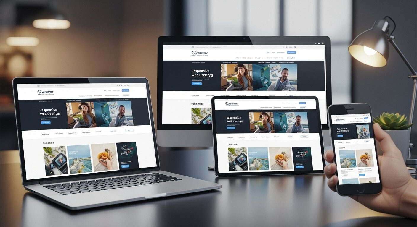
Responsive Web Design Best Practices: Building Adaptive Experiences Across Devices
In today’s digital landscape, a website’s success hinges on its ability to deliver a consistent and engaging experience across a myriad of devices. Therefore, understanding and implementing Responsive Web Design Best Practices is no longer optional; it is absolutely essential. This comprehensive guide will explore the fundamental principles, technical considerations, and optimization strategies required to build truly adaptive websites.
Responsive Web Design (RWD) represents an approach to web development that allows a website’s layout and content to adapt fluidly to different screen sizes, orientations, and resolutions. Initially, designers created separate versions of websites for desktops and mobile devices. However, this proved inefficient and difficult to maintain. Consequently, RWD emerged as a more elegant solution, ensuring a single codebase could cater to all users, regardless of their viewing device. By embracing these practices, developers can significantly enhance user experience, improve SEO, and streamline development workflows.
Core Principles of Effective Responsive Web Design
Adhering to core principles is crucial for successful responsive implementation. These foundational concepts guide the entire design and development process, ensuring adaptability and user-centricity.
Mobile-First Approach
Developing with a mobile-first mindset means designing for the smallest screen first, then progressively enhancing the experience for larger screens. This strategy forces developers to prioritize content and functionality, leading to cleaner code and improved performance. Moreover, it addresses the constraints of mobile devices from the outset, such as limited screen real estate and touch interactions. When you start small, adding complexity for larger screens becomes a natural extension, rather than trying to remove it for smaller ones. Therefore, this approach ofte results in a more streamlined and efficient design process.
Flexible Grids and Layouts
Flexible grids are the backbone of responsive layouts. Instead of fixed pixel widths, responsive designs utilize relative units like percentages, `em`, `rem`, `vw`, and `vh` for widths and spacing. This allows elements to resize proportionally to the viewport. For instance, a column might occupy 50% of the screen width on a desktop but stretch to 100% on a mobile device. Furthermore, CSS Flexbox and Grid Layout offer powerful tools for creating complex, yet highly flexible, layouts. They enable precise control over element positioning and distribution, adapting seamlessly across various screen sizes. Indeed, mastering these CSS layout techniques is paramount for robust responsive design.
Fluid Images and Media
Images and other media elements must also be fluid to prevent layout breakage. Fixed-width images can overflow containers on smaller screens, destroying the responsive layout. To mitigate this, set `max-width: 100%;` and `height: auto;` on images within CSS. This ensures images scale down proportionally without distorting their aspect ratio. Additionally, consider using the “ element or `srcset` attribute for responsive images. These HTML5 features allow browsers to load different image versions based on device capabilities, optimizing performance by serving smaller files to mobile users. Clearly, optimizing media is a vital component of Responsive Web Design Best Practices.
Implementing Responsive Web Design Best Practices: Technical Aspects
Effective responsive design relies heavily on specific technical implementations. These tools and techniques are essential for translating design principles into functional, adaptable websites.
Media Queries: The Cornerstone
Media queries are CSS rules that apply styles based on device characteristics, such as screen width, height, orientation, and resolution. They allow designers to define breakpoints at which the layout or styles should change. For example, you might have one set of styles for screens up to 768px wide (typical tablet portrait) and another for screens wider than that. Therefore, `min-width` and `max-width` are commonly used in media queries to target specific ranges. It’s advisable to define breakpoints based on content needs rather than specific device dimensions, as the device landscape is constantly evolving.
“`css
/ Styles for screens smaller than 768px /
@media (max-width: 767px) {
.container {
width: 100%;
padding: 15px;
}
}
/ Styles for screens 768px and wider /
@media (min-width: 768px) {
.container {
width: 750px;
margin: 0 auto;
}
}
“`
Viewport Meta Tag
The viewport meta tag is a critical HTML element that instructs the browser on how to control the page’s dimensions and scaling. Without it, mobile browsers might render the page at desktop width and then scale it down, making text unreadable. Including “ in your “ section is non-negotiable for responsive sites. This tag sets the viewport width to the device’s width and prevents initial scaling, ensuring your responsive styles are applied correctly.
Relative Units (%, em, rem, vw, vh)
As mentioned earlier, relative units are fundamental to flexible layouts. Percentages (`%`) are great for widths and heights relative to the parent element. `em` units are relative to the font-size of the element itself, while `rem` units are relative to the font-size of the root “ element. This makes `rem` particularly useful for consistent typography scaling. Furthermore, `vw` (viewport width) and `vh` (viewport height) are relative to the viewport’s dimensions, offering powerful control over elements that need to scale with the screen. Consequently, moving away from fixed pixel values for layout and typography is a key responsive practice.
CSS Frameworks and Libraries
Utilizing CSS frameworks like Bootstrap, Tailwind CSS, or Bulma can significantly accelerate responsive development. These frameworks provide pre-built responsive grids, components, and utility classes that handle many common responsive challenges. Bootstrap, for instance, offers a robust 12-column grid system and a wide array of responsive components. Tailwind CSS, on the other hand, provides highly customizable utility classes for building designs directly in your HTML. While they offer speed, it’s important to understand how they work and customize them to avoid bloated code. They can be powerful allies in implementing Responsive Web Design Best Practices efficiently.
Enhancing User Experience (UX) in Responsive Design
Responsive design is not just about adapting layouts; it’s also about optimizing the user experience for different contexts. Thoughtful UX considerations are vital.
Prioritizing Content
On smaller screens, space is a premium. Therefore, content prioritization becomes paramount. Identify the most important information and actions for mobile users and ensure they are immediately accessible. Less critical content might be hidden behind expandable sections or placed lower on the page. This approach ensures users can quickly find what they need without excessive scrolling or navigation. Ultimately, a clear hierarchy improves usability significantly.
Touch Target Sizes and Accessibility
Mobile users interact with screens using their fingers, not a precise mouse cursor. Consequently, interactive elements like buttons and links must have sufficiently large touch target areas to prevent accidental taps. Google recommends touch targets of at least 48×48 pixels. Furthermore, responsive design must also consider broader accessibility guidelines (WCAG). This includes ensuring proper contrast ratios, keyboard navigation, and screen reader compatibility across all breakpoints. Adhering to these principles makes your website usable for everyone, regardless of their abilities or device.
Navigation Patterns
Traditional desktop navigation menus often don’t translate well to mobile screens. Responsive design calls for adaptive navigation patterns.
FAQs (Frequently Asked Questions)
1. What is responsive web design?
Responsive web design is a method of building websites that automatically adjust to different screen sizes, ensuring a smooth experience on mobiles, tablets, and desktops.
2. Why is responsive design important?
Because most users browse on mobile devices, responsive design improves user experience, increases engagement, and boosts SEO performance.
3. How does responsive design affect SEO?
Google prioritizes mobile-friendly sites. A responsive website loads faster, improves readability, and reduces bounce rate — all of which help your SEO ranking.
4. What tools help test responsive design?
Tools like Chrome DevTools, BrowserStack, and Responsinator let you preview your website on different screen sizes and devices.
5. What are the key elements of responsive web design?
Flexible grids, fluid images, media queries, readable typography, and optimized navigation are the main elements.
6. Can responsive design improve website speed?
Yes. With optimized images, lightweight code, and mobile-first development, responsive sites load faster and perform better.
7. Is a mobile-first approach necessary?
Not required, but highly recommended. Designing for mobile first ensures a clean structure, better performance, and improved UX.
8. Do I need a special website for mobile?
No. Responsive design eliminates the need for a separate mobile site by adapting a single layout to all device sizes.
9. How often should I update my responsive design?
You should review your design at least once or twice a year to match new device sizes, UI trends, and performance standards.
10. Can responsive design increase conversions?
Yes, because a smoother mobile experience encourages users to stay, explore, and take action — whether it’s buying, signing up, or contacting you.
Conclusion
In conclusion, responsive web design is essential for creating modern, user-friendly, and high-performing websites. As devices continue to evolve, users expect seamless experiences across every screen size. By following best practices such as flexible layouts, mobile-first design, optimized images, and clean navigation, you ensure your website remains accessible, fast, and engaging. A responsive site not only improves user satisfaction but also boosts SEO visibility and strengthens your brand’s online presence. When done right, responsive design turns your website into a future-proof digital platform that delivers consistent value to every visitor.
If you want SEO and social media services, contact us on WhatsApp or through our contact page.
want to read more article click here


